Friday, 9 January 2015

Special stamps: 50 years of Royal Mail designs

In 1965, then-postmaster general Tony Benn asked designer David Gentleman to create new illustrations that would modernise stamp design. Fifty years on, the Royal Mail has 2,663 special stamps to show as part of its collection, ranging from the commemoration of the 1940 Battle of Britain to celebrating the “life” of fictional character Sherlock Holmes in 1993. To mark the 50th anniversary of their non-Royal-related stamp programme, we ask a selection of experts about their favourite design from each decade.  

Michael Johnson, founder, Johnson Banks

Special Stamps 50th anniversary Royal Mail Battle of Britain 3
1965: 25th Anniversary of the Battle of Britain
This is a really early example of David Gentleman’s skill at designing tiny pieces of gummed paper. The way that the aeroplanes criss-cross and the colours overlap, and the depth of the compositions is world-class. Stamps had never looked like this before.
Special Stamps 50th anniversary Royal Mail Broadcasting anniversary
1972: Broadcasting Anniversaries
Another David Gentleman one – I’ve always thought this was a masterful piece of cropping with regards to the image, and such a singular object to feature on a stamp.
Special Stamps 50th anniversary Royal Mail British Greenwich Meridian
1984: Centenary Greenwich Meridian 
Howard Waller’s meridian stamps have a great “powers of ten” feel as we start hovering above the earth’s surface then progressively get closer to Greenwich. They have a great “found” design quality to them – the only unifying factor is the red line.
Special Stamps 50th anniversary Royal Mail British aircraft designers
1997: British Aircraft designers
Bruce Duckworth’s “designers in the clouds” must count as one of the best trompe-l’oeils ever committed to a design this small.
Special Stamps 50th anniversary Royal Mail British Lest we forget
2006: Lest We Forget
On balance I think there are probably too many war commemoration stamps and not enough forward thinking – but this fusion of barbed wire and the stems of poppies has always stood out for me. (Design: Hat-Trick).
Football
2013: Football Heroes
It’s not the footballers, or the illustration that I love – it’s the genius of having 11 stamps in the set that gets me. (Design: True North).
Johnson has designed 46 stamps himself, including the Royal Mail’s Beatles set in 2007.
 

Philip Parker, head of stamp strategy, The Royal Mail

 
Special Stamps 50th anniversary Royal Mail British Concorde
1969: Concorde
Marking the first flight of Concorde, this elegant David Gentleman design is probably the simplest artwork of all time. Two sheets of coloured film, spray painted, were cut with a scalpel to form the instantly recognisable profile. Over five decades Gentleman has designed more than 100 Special Stamps, his work always distinctive.
Special Stamps 50th anniversary Royal Mail Sailing
1975: Sailing
It was purely coincidental that Andrew Restall’s designs overlapped with Rod Stewart’s chart hit of the same name. Nothing as colourful, as “loose” (and perhaps as joyous) had been seen on stamps before. Restall’s major contribution to stamps included his Fellowship in Stamp Design at the RCA (instigated by Tony Benn).
Special Stamps 50th anniversary Royal Mail Flowers
1987: Flowers
Stamps have been a vehicle for leading photographers and Alfred Lammer created what I consider to be some of the most beautiful stamps ever. Using only natural light and shooting flowers in situ, he would wait for hours before the conditions were right for a shot. The stamps were a feature of his newspaper obituaries when he died in 2000.
Special Stamps 50th anniversary Royal Mail Darwin's theory
1999: Darwin’s Theory (from September 1999 Scientists’ Tale stamp set)
The Millennium Stamps were Royal Mail’s most ambitious programme, with every issue of 1999 exploring 1000 years of history with 48 leading image-makers contributing. Ray Harris-Ching is a wildlife artist like no other, meticulously painting mostly birds, and is somehow able to give each an individual character. His ingenious interpretation of Darwin’s theory of evolution placed a Galapagos Finch on the fossil of the first known bird.
Special Stamps 50th anniversary Royal Mail The Beatles
2007: The Beatles
Perhaps not surprisingly, The Beatles stamps of 2007 are Royal Mail’s biggest selling issue of the last decade. It’s also notable for its depiction of living people. Before 2007, identifiable living people other than members of the Royal Family had hardly ever been seen on stamps. Designed by Johnson Banks, the stamp’s irregular shape is created by an image of the band’s iconic album stacked on top of a pile of LPs - I enjoy identifying the hidden albums.
Special Stamps 50th anniversary Royal Mail WWF
2011: WWF
Stamps to mark the conservation group’s 50th anniversary included ten close-cropped images of the faces of endangered species. It’s incredibly hard to select one, but the Amur Leopard is striking and beautiful. Designed by Rose, the simple idea of the creature gazing straight out at you is effective – the fact that there are less than 40 left in the wild is sobering.

Dean Shepherd, editor, Gibbons Stamp Monthly magazine, Stanley Gibbons

Special Stamps 50th anniversary Royal Mail Battle of Britain 4
1965: 25th Anniversary of The Battle of Britain
It’s not only the bold design of this set, particularly those created by David Gentlemen, which I like – it also reminds me of the battle going on behind the scenes as Tony Benn, the then-postmaster general, and David Gentleman campaigned to have the Queen’s head removed from British stamp design. They didn’t succeed!
Special Stamps 50th anniversary Royal Mail Philympia
1970: Philympia 70 Stamp Exhibition
Stamp-on-stamp designs are very popular and this David Gentleman one, issued to commemorate the Philympia stamp exhibition in 1970, is one of the best. It showcases three ground-breaking issues of the Victorian era: the first line-engraved stamp (the famous Penny Black of 1840); the first embossed stamp (the One Shilling Green of 1847) and the first surface printed stamp (the Fourpence Carmine from 1885), to give a wonderful timeline of this pioneering era of stamp design.
Special Stamps 50th anniversary Royal Mail Transport and Mail Services
1988: Transport and Mail Services in 1930s
This set issued for the 1988 Europa competition and designed by Mike Dempsey recreates the look of those superb art deco-style posters of the 1930s, as well as the distinctive architecture and engineering masterpieces of the era. The fact that each mode of transport shown on the stamps has a link to the postal service is an added bonus.
Special Stamps 50th anniversary Royal Mail Sherlock Holmes
1993: Sherlock Holmes (centenary of the publication of The Final Problem)
I really admire the artwork of Andrew Davidson. His distinctive designs used for this issue, marking the centenary of the death of the Sherlock Holmes character, are excellent and the elongated format of the stamps adds to the appeal. Plus, as each stamp features a hidden letter that spells out a word related to Sherlock Holmes, viewers have to get out their magnifying glasses and do a little bit of detective work of their own.
Special Stamps 50th anniversary Royal Mail first pillar box
2002: 150th Anniversary of the First Pillar Box
Designed by Silk Pearce, not only does this set show the evolution of the pillar box over the years but as the stamps were engraved and recess printed they have a wonderful texture to them that was lost to most stamps of the era. This is also my favourite as the engravings were done by the legendary Czeslaw Slania – arguably the best stamp engraver of all time.
Special Stamps 50th anniversary Royal Mail Accession George V
2010: Centenary of the Accession of King George V
This is by far my favourite stamp of the decade as it celebrates some of the most attractive British stamps ever created – in particular the high value Seahorse design by Bertram Mackennal. This is regarded by many, including myself, as Britain’s most beautiful stamp.
All images are courtesy of the Royal Mail.

(Thu, 8 Jan 2015 | By Sarah Dawood )

Thursday, 8 January 2015

What they don't teach you at design school

Following his recent Design Business Association talk, Dew Gibbons’s Steve Gibbons outlines the lessons he has learned in his career.
Steve Gibbons
I was recently invited to speak at a DBA seminar for junior agency employees on what I have learned through my career. I’m no Einstein, but I do share his observation – the more I learn, the more I realise I don’t know. From what I do know, here are nine things I’ve learned – and that you’re rarely taught.

1. Learn how to ask questions

You can’t get to the right answer without asking the right question. Starting with detail makes it hard to climb back to the bigger picture. Use the GROW acronym to guide you. G is for Goals – ask about the vision. R is for Reality – ask what’s happening now. O is for Options – ask what they are. And W is for Will – ask about the barriers. 

2. Learn how to listen

We can be so pleased by posing a clever question that we forget to listen to the answer. Don’t be over-assiduous in note-taking – concentrating on writing down the words means you don’t listen. Get someone else to take notes. Alternatively, jot down some key aide memoires and write up notes immediately afterwards.

3. Build trust

It’s simple ­– say you’re going to do things and make sure you do them when you say you will. If you can’t, ask permission to extend the time available. In asking the question, you’ve acknowledged that you’d made a promise but may now need to reset expectations.

4. Learn how to say no

Not being able to say no is a problem. If you don’t learn to do this, other people’s priorities will take precedence. Sometimes saying yes isn’t to anyone’s advantage – it’s your responsibility to point that out. Find a way to articulate it by keeping the client’s perspective in mind. In trying to solve your client’s immediate problem you might not keep anyone happy.  

5. Don’t take it personally

Clients are people, just like you and me. It’s too easy to see them as a separate species. Normally a client is being difficult because someone else is making life difficult for them. Empathy is really important – do your best to understand their problem. Then that problem is both shared and halved. In return they’ll be much nicer to you.

6. Become indispensable

Your role is to make your client look good. It’s a very useful mindset to adopt. Become their wingman, know their business and brand better than they do. Send articles and tidbits of interest. Offer opinions and be the devil’s advocate. Also become indispensible to your own company, be the go-to person for as much as possible (point number 4 notwithstanding).

7. Be self-aware

Have a sense of who you are as a person. There are a lot of online guides that allow you to do your own psychometric assessments. Self-awareness allows you to understand why you react as you do to certain people and visa versa, and learn to change your behaviours accordingly.

8. Celebrate your successes

Enjoy the good times because inevitably there will be tougher times. Don’t be too hard on yourself, there will probably be others to do that for you. Celebrate all your successes – winning a pitch or an award, or when someone new joins. Celebrating success makes it easier to share failure. Come clean about bad news as quickly as you share success. Keep a file of all the nice emails you get and re-read them if you need a boost.

9. Be broad in your interests

This is important for everyone, and especially for designers. Great ideas are about finding links between otherwise unconnected things. Everything you learn through life is grist to the mill. Broaden your interests as much as possible.
Steve Gibbons is managing director at Dew Gibbons + Partners.

(Wed, 7 Jan 2015 | By Steve Gibbons )

Wednesday, 7 January 2015

Humorous hand-painted signs exhibited in East London

An exhibition celebrating the diversity of sign painting is set to open in February – and it’s gone for a light-hearted approach based on fictional, bizarre slogans.
Business as Usual Ged Palmer
Ged Palmer
Business as Usual, taking place at The Book Club bar in East London, will showcase an eclectic mix of hand-painted signs by a variety of artists. It aims to inject humour into design through slogans that use fictional business and product names, exhibition organiser Ged Palmer says.
“The idea is to have really high quality work that’s not taking itself very seriously, because it’s just silly,” Palmer, a freelance lettering artist and sign painter himself, says.
Business as Usual sign
Slogans on signs include “Finest wines available to humanity”, “Extra strength English mustard distributed by A.S. Keen” and “Earnest Shramp and Co. ladies’ bicycle saddler” and “Penrith Tearooms”.
Business as Usual Tristan Kerr
Signs by Tristan Kerr
The exhibition was directed by Liat Chen, and curated by Palmer. Artists who have contributed to the exhibition alongside Palmer include Ash Bishop, Dapper Signs, Carl Fredrik, Dry British, Jack Hollands, Proudfoot, Letterknight, Von Leadfoot and Tristan Kerr.
“The exhibition is positive for the trade,” Palmer says. “Signs are usually functional – they’re not something you put in a gallery. This is a nod to the fact that this is what we do for a living.”
Business as Usual Dapper Signs
A sign by Dapper Signs
The show will also enable collaboration between sign painters nationwide, he says: “There will be healthy competition, and there will be the vibe of a community. It’s good to be social without the social media.”
Materials used include wood, metal, glass, gold leaf and enamel. The exhibition design will have a mural effect, with hand paintings on the walls and windows, and physical features such as an old Chevrolet car door that will be reconditioned and coated, and torn up billboard posters.
“It’ll be embracing the higgledy piggledy,” Palmer says. “The premise of the show is that we’ll be promoting fictitious, ludicrous products and services. The aim is not to have people scratching their chins - it’ll be really light-hearted.”
Business as Usual runs from 6pm on 12 February until 12 April 2015 at The Book Club, 100-106 Leonard Street, London, EC2A 4RH. Some work is also due to be showcased at Stories, 30-32 Broadway Market, E8 4QJ.

(Tue, 6 Jan 2015 | By Sarah Dawood )

Tuesday, 6 January 2015

Spring/Summer 2015 trend watch
 It may be cold outside, but January brings a seismic shift in fashion, with the old winter collections making way for new spring deliveries. The department stores are already displaying the season's key styles, and below is a summary of the trends that have made it from the catwalk to the stores.
Khaki: Since it first hit the runway over 40 years ago, khaki has become a fashion classic, returning this season with a bang. Appearing in varying styles for a number of fashion houses, we saw suede khaki pieces at Chanel's feminist protest, Marc Jacobs's sharp military silhouettes and Ralph Lauren's safari-style glamour.
Kimono: With long silhouettes tied at the waist, the Kimono proved to be an inspiration for a number of fashion houses this season. From Marni's cream outfit accentuated with an oversized black belt, to the delicate floral design inspired by a Hokusai drawing at Gucci and Céline's sleek black silhouette with exposed seams and a deep blue belt mirroring the look of martial arts.
Nautical: Fashion Week took to the coast for next season, as a sea breeze swept over the runways in Milan, New York and Paris. From an oversized coat at Lanvin, a yachting-inspired dress at Chloé and Marc Jacob's nod to the sailor's uniform, designers set sail in search of new horizons.
Spring/Summer 2015 trend watch
Saturday Night Fever: Hedi Slimane at Saint Laurent set the tone for this trend with his rock glam inspired collections. For spring there were shiny leopard dresses by Slimane to an ultra-short, lurex effect one-shouldered dress seen at Isabel Marant and head-to-toe shine at Tom Ford.
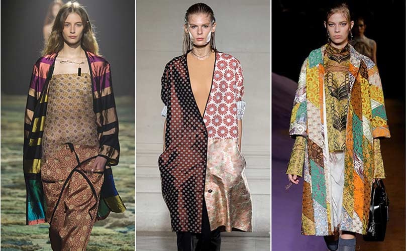
Patchwork: As seen at Maison Martin Marginal, Proenza Schouler and Marni, a mix and match of fabrications, patchwork, colour, eclectic looks and conceptual silhouettes took centre stage.
Spring/Summer 2015 trend watch
Vintage: Designers show their flair for the eclectic, bringing together vintage fabrics, using unexpected combinations of prints and textures. The proof is the incredible fabrics at Dries Van Noten, the graphic foliage and florals at Maison Martin Margiela, and Prada's eastern evocations.
Anydrogy: Many years have passed since women first conquered the male wardrobe, so this season the designers were keen to return to the codes of masculine suits, bringing a touch of sexy, adrogynous style to contrast the more feminine looks that graced the runway. The trend reveals itself in the asymmetric cuts seen at Anthony Vaccarello, the strong streetwear edge at Sonia Rykiel and the against-the-grain, tennis striped fabric at Maison Martin Margiela.
Photo 1: Saint Laurent - Isabel Marant - Tom Ford  Photo 2: Dries van Noten - Maison Martin Margiela - Prada

Monday, 5 January 2015

New international photography fair set to launch in London

Somerset House is set to host an international photography fair and exhibition in May, produced by curating consultancy Candlestar.
Photo London Somerset House
©Studio Integrate
Photo London will feature a selection of works by 65-70 galleries worldwide, handpicked by a curatorial panel of seven established curators and directors.
Alongside the fair, there will be talks, screenings and events, supported by the non-profit arts organisation LUMA Foundation. “There will be a lively public programme of installations in the courtyard, an exhibition of unseen gems from the V&A museum’s photography collection, and a music and photography programme, featuring musicians sharing photography that’s important to them,” says Michael Benson, director at Candlestar.
The chosen participating galleries will be announced on 5 February. “The panel are looking for new artists, or new works by established artists, rather than work already seen at other art fairs,” Benson says. “Our brief is that it should be a unique exhibition, and the work should be artistically sensible – the curators are looking for artistic quality, things they haven’t seen before and work that has commercial impact.”
Galerie Les Filles du Calvaire, Corinne Mercadier, Solo series
The curatorial committee consists of: William Ewing (photography curator and writer), Tobia Bezzola (director of the Museum Folkwang), Maryam Eisler (editor of art book Sanctuary: Britain’s Artists and their Studios), Wendy Watriss (founder of FotoFest), François Hebel (previous director of Les Rencontres d’Arles), Sebastien Montabonel (former photography specialist at Phillips auction house) and Sofia de Maduro (curator and collector).
Galerie Les Filles du Calvaire, Karen Knorr, India Song series
A “Discovery” section of the fair will feature newly founded galleries, and an award sponsored by the John Kobal Foundation will be given to the most outstanding emerging photographer, offering a two-month residency in New York.
The photography fair will be showcasing international work from Europe and America, but also Asian countries such as Japan and India. “We’ve always felt that London really needed its own photography fair, like New York and Paris,” Benson says. “The aim is to showcase the very best photography by established and younger galleries, and from both established and unseen artists. It’s a fair for major players in the field of photography across the world.”
Candlestar, which is now based in Somerset House, develops and curates art and education projects, and specialises in photography initiatives. It has curated over 50 exhibitions worldwide in the last five years, and helped to create the Prix Pictet photography award and exhibition.
Photo London will take place 21 – 24 May 2015 at Somerset House, Strand, London, WC2R 1LA.
Anthony Hernandez - Discarded. © Thomas Zander - Cologne.
Anthony Hernandez, Discarded. © Thomas Zander, Cologne.


Saturday, 3 January 2015

Design industry predictions for 2015


Retail

Jeff Kindleysides
“My predictions for 2015 fall under different areas: Digital – there will be natural integration within environments and more use of order in store, as a progression of what is now a part of retailers’ daily lives and an expectation of consumers. Experiential – retailers and brands will develop more experiential environments for shopping physically as knowledge and connectivity grow – especially around the definition of service, in-store knowledge and one-to-one dialogue with customers. Definition of value – value isn’t, and can’t just be, price. The supermarket sector is set to hit a wall of new learning. Experimentation – we’ll see new retail formats emerging, which will leverage the equity and expertise of brands and translate them into new and experimental stores. These will be relevant to location, size and specifically targeted product selection. Agility – retailers will need to continue to keep retailing fresh and relevant, and stores will need to become more capable of change on a day-to-day basis. Availability – the customers’ expectations of finding what they want when they want will inevitably play a big part in the function of stores going forward – could it mean more small, localised stores? Shop in store, order in store, try in store, collect at a place of convenience – all will play a big part in future thinking.”
Jeff Kindleysides, founder, Checkland Kindleysides

Packaging

Shaun Bowen
“The strongest brands have always found ways of building an emotional connection with their consumers. But in recent years that urge to create a sense of intimacy has been seized upon by the most mainstream of brands and reduced to a handful of design clichés. Whimsical illustrations, hand-drawn type and twee copy lines now dominate the supermarket shelves. So in 2015 it will be the job of packaging designers to find fresher, more engaging and more original ways to tell a brand’s story. In an environment dominated by faux honesty, the need for authenticity has never been stronger.”
Shaun Bowen, creative partner, B&B Studio

Interiors

Ab Rogers
Ab Rogers
“2015 is an exciting time to be an interior designer – our profession has never been more important. This year, the year of the sheep, will be game-changing. Sensorial poetic design will challenge the way spaces look, sound and function, and the way we use them to work, rest, learn and travel. We will see design appear in unexpected locations, designing around the occupancy experience – it’s not about style but super-function in its broadest sense. The new magnificently inventive Second Home by SelgasCano is a fine example, while Barber & Osgerby’s new designs for Crossrail will revolutionise the experience of travel. The Maggie’s Centre in St Bart’s Hospital by Stephan Holl will create an empowering and radical space for patients.” 
Ab Rogers, founder, Ab Rogers Design

Furniture 

Luke Pearson
© Mark Cocksedge
“The next year could go in a number of directions as the world economy is so unstable – somehow, the economic flux mirrors a cultural one in terms of design. There is more diversity, more choice, more progress, more experimentation and more activity than we have potentially ever seen. There is a viral activity that has even started to influence the biggest companies. From Kickstarter to Hacking from global sourcing to a rebirth in local craft networks, everything is ultimately on the table.”
Luke Pearson, director, PearsonLloyd

Exhibition

Dinah Casson
“It’s going to be tough. The government cuts haven’t really got going yet and local authorities are already struggling. As most of our work is in the public sector, we will inevitably be affected. We will have to continue to find new ways of working – to do more for even less; but the bit that suffers is the time set aside to cook ideas, to change ideas, to have better ideas. In the end, it is the quality of the project that we have to protect, and that’s going to be tough.”  
Dinah Casson, founder, Casson-Mann

Editorial

Jeremy Leslie
“2015 will continue to be an exciting time for editorial design: the ups and downs of the business offer creative opportunities. Large publishers with deep pockets will pour budget into their magazines (New York Times Magazine, US Wired) and the braver independents will continue to innovate on peanuts (The Gourmand, Delayed Gratification, Flaneur). Those stuck between these two extremes will struggle to keep up. Print and digital will cosy up ever closer –expect further editorial design developments online and more digital businesses launching print mags. But unless someone cracks it soon, the magazine iPad app will be forgotten as a creative option.”
Jeremy Leslie, creative director, magCulture

(Design week Jan 2015)

Friday, 2 January 2015

Design industry predictions for 2015 – part one

In the first part of our series of design industry predictions for 2015, leading industry figures tell us what they think will happen in branding, graphics, interactive and product design, and financial performance.

Branding

Marina Willer
“For a while, brands have been opening up and trying to incorporate change. To a point, this has become the norm. People are skeptical of branding because everything seems constructed – even the most flexible, open and participative brands seem to be carefully composed by some specialists in a brand lab, where everything is meticulously calculated based on trends in the digital world. Maybe the way to go is less brand interference. Ultimately, brands need to exert less control – and I don’t just mean that brand labs need to design things that look ‘undesigned’. Brands just need to get out of the way. Luckily design is not just about branding. Maybe, to create things, we need to start with what people truly need and give it form, life and expression.”
Marina Willer, partner, Pentagram Design

Graphics

Simon Elliott
“On a positive note, I predict an increase in international requests for British design expertise in 2015. Nearly 40 per cent of our business came from outside the UK in 2014, and we’re anticipating further growth in exciting overseas opportunities next year. On a negative note, I also predict we’ll get asked – and will promptly decline – to free pitch for something within weeks of returning in the new year. So please can 2015 be the year that sees requests for (and the mugs who agree to) free pitching, stop. How can anyone take our industry seriously when people give away what most of us are trying to make a living from?”
Simon Elliott, partner, Rose Design

Interactive

Clair Neal
“I think we’ve been saturated by digitilisation over the past few years and we’re enjoying a bit of a physical renaissance. Over the next 12 months we’ll definitely see more connected objects – not just from 3D designers adding digital features to products, but also digital designers looking for new ways to engage a screen-fatigued audience through tactile interfaces. In February 2014, the late great Berg showcased their connected washing machine prototype Cloudwash. It sparked much debate around the genderisation of household appliances, internet devices and interaction design. I don’t think this was an issue that they were trying to tackle with this project but it would be great to see more contentious white goods in 2015!”
Clair Neal, lead designer, Kin Design

Product

Sebastian Conran
© Richard Seymour
“With a comparatively small product design team of 18 people at Apple, the company makes a huge impact by transforming science and technology into outstanding user experience and consumer culture. This demonstrates the power and potential of excellent early-stage industrial design in combination with world-leading class science and technology. The efficiency of modern communication now enables small teams of UK designers to work effectively with businesses around the world, whether an entrepreneurial start-up or an established brand using more of a Silicon Valley modus operandi. With the fast-growing and ageing population, the focus on smart homes enhancing the experience of later life, and the thoughtful design of robotics and autonomous systems will also be an area of interest. We need to design for our future selves.”
Sebastian Conran, founder, Sebastian Conran Associates

Financial Performance

Esther Carder
“I don’t mean to be doom and gloom, but I am not sure that 2015 will be much easier for design than 2014 was. Continued pressure on staff costs, particularly those with digital expertise, will continue. Design work is often procured on a project-by-project basis, making planning ahead more difficult. Permanent staff are usually complemented by a raft of people engaged on a freelance basis, to manage the peaks and troughs as well as to provide specific skill sets. Freelancers, particularly those with digital expertise, come at a price. Utilising the available resources in the most efficient way is absolutely key to optimising margins.”
Esther Carder, partner, Kingston Smith W1

(Design Week Jan 2015)